As I continue occasionally tinker on the redesign I've started (and often think "what's the point, current design is fine"), I wanted to share some of the problems I've run in to. Problems mostly for me because I'm not a designer, and I don't have the wiring to know what works.
Mono fonts
A mono font is fairly important to this blog because a large part centres around code (though, reviewing, I can't find any recent posts that included a wall of code… maybe that's good?!). I also decided early on that the headings would use the same font (partly to keep the font count to three - article body, UI and mono font).
The trouble is that I'm so used to mono fonts for code (as I live in VS Code all the time these days), it's hard to see anything else. I tried a few variations, and quite liked F37 Zagma Mono (partly because I could pay for it, partly because it was a UK based design), but ultimately I wasn't happy with it for larger code blocks.
I also looked at Space Mono - but decided I don't like the W character.
I landed on Victor Mono, which I think works for titles and for code. But here's the rub: is it too stylistic for code? I'm not sure.
Here's Victor Mono, shown at the top, compared to Ubuntu Mono at the bottom (which is what my current design uses):
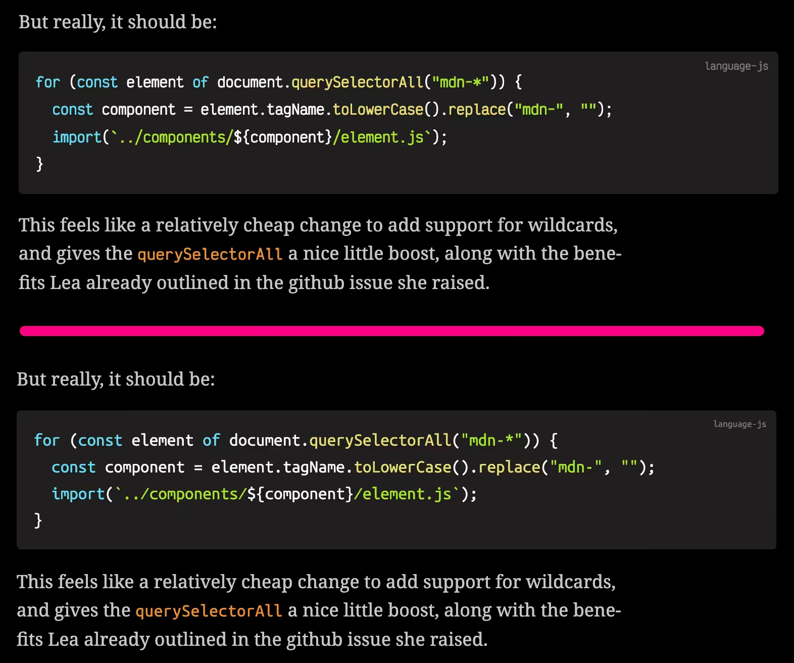
I feel like I can scan Ubuntu Mono faster that Victor Mono because of the wider glyphs. The inline code text (querySelectorAll) I think can be fixed by using font-size-adjust to get it to roughly align with the body text. However, I do like the zero with a diagonal strike through it that Victor Mono supports through font-variant-alternates (reminds me of my Spectrum days).
I wonder if I need to sit with it longer to see if it works for me. I know that it's because I'm so used to the fonts on my blog that it's hard to see change (also why I keep questioning whether I should even finish this project).
So that's problem number 1.
Alignment
My plan for the blog post pages is that I have a max-width of 60ch (me basically sticking my finger in the middle of this), but code, image, videos and frames break out that width.
This means I've got a block of CSS like this:
h1,
h2,
h3,
h4,
h5,
h6,
p,
ul,
ol,
li,
hr,
blockquote {
  max-width: 60ch;
}
The trouble was I'd noticed that the blockquote appeared to be more narrow than the p tags:
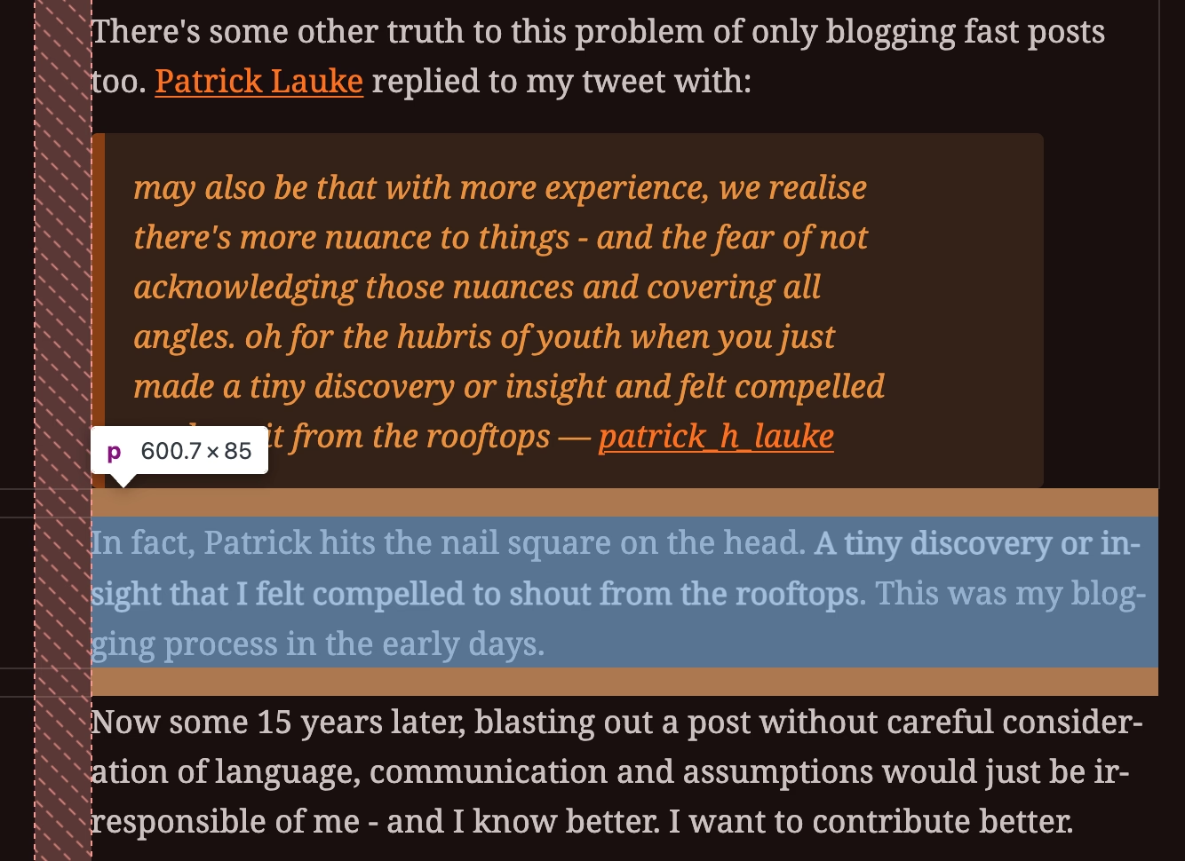
I'd dug around for what could cause it but couldn't spot it. I'd settled on simply setting the blockquote to 67ch (which is arbitrary and stupid).
It was Jake taking a peek on the train that spotted the issue. In fact, the issue I was seeing was also applying to li widths and that's how we solved it.
I was using p, li { font-size-adjust: 0.6; } (I think I was adjusting the blog post text size to match the UI font) which caused the problem.
When the ul or blockquote has a max-width: 60ch this is defined by the width of the characters. Let's say a single ch is 10px. However, adding the font-size-adjustment was causing the width calculation to change, and thus confusing me with it's slightly more narrow element (whilst the font looked nearly the same).
Navigation
I'm struggling here. I've never been good at styling navigation unless it had an obvious home.
I feel like across the top feels utterly plonked on the page, either with the gap or without.
I tried vertical alignment, but I feel like it should be to the left of the actual article, but I'm not sure how I can get it there without either placing the nav actually inside the article content (which…might be the answer, but feels semantically awkward). It would also push the article metadata (and social interactions) further down and visually it's not really connected to the navigation - so…I'm not sure.
Then I also tried below the article. Which definitely seems like a sensible place for the next and previous post (which I can expand to include the full titles), but putting the home and search link at the end feels really weird. It also means the home link is in a really odd spot. I'd expect to find it top/left, but instead it's almost bottom and to the left.
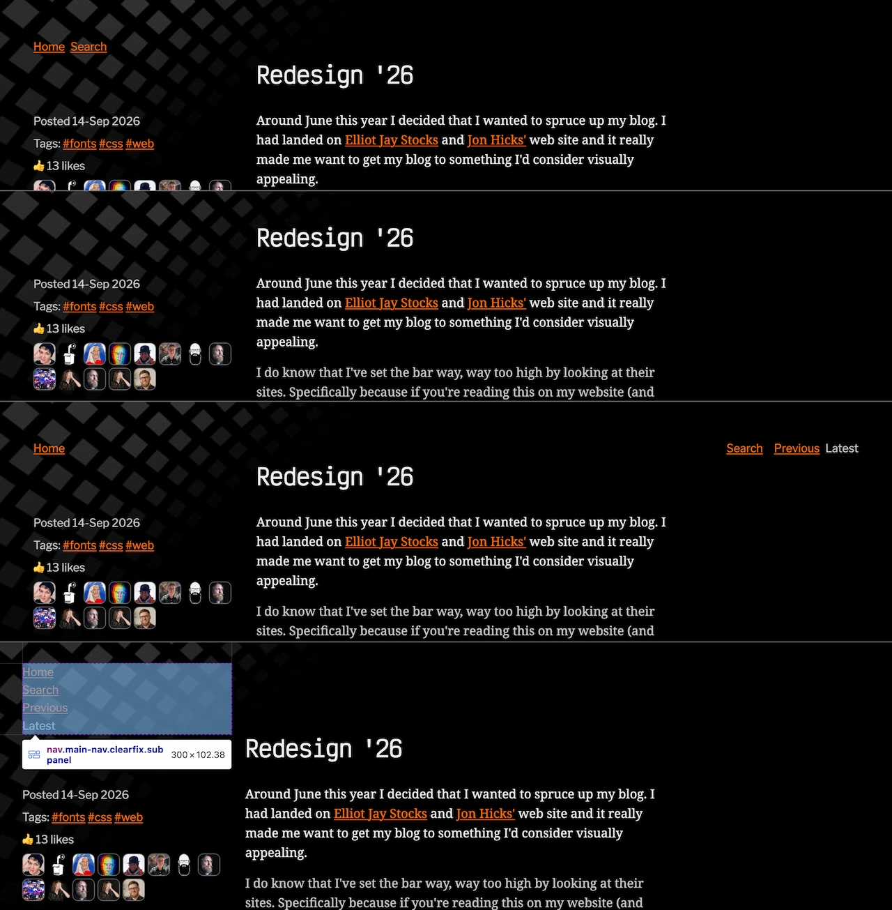
So, yeah, still unsolved. More a case of documenting my process and a bit of rubber-ducking.


