As with each year for the FFConf web site, I have a distinct idea of the visual style I want. It has zero to do with the content we're presenting each year, but I do love how FFConf's site can be creative.
It was like that from the very first web site - the logo was designed in early 2009 in 12 variations (which you can see from years 2009, 2010 and 2011 before they were really redesigned).
Before I (inevitably) forget, it made sense for me to write up some of the things I learnt along the way now that the 2026 web site is live.
I think Chris Mahon's did an excellent job with his translation of my mood board into Figma pages.
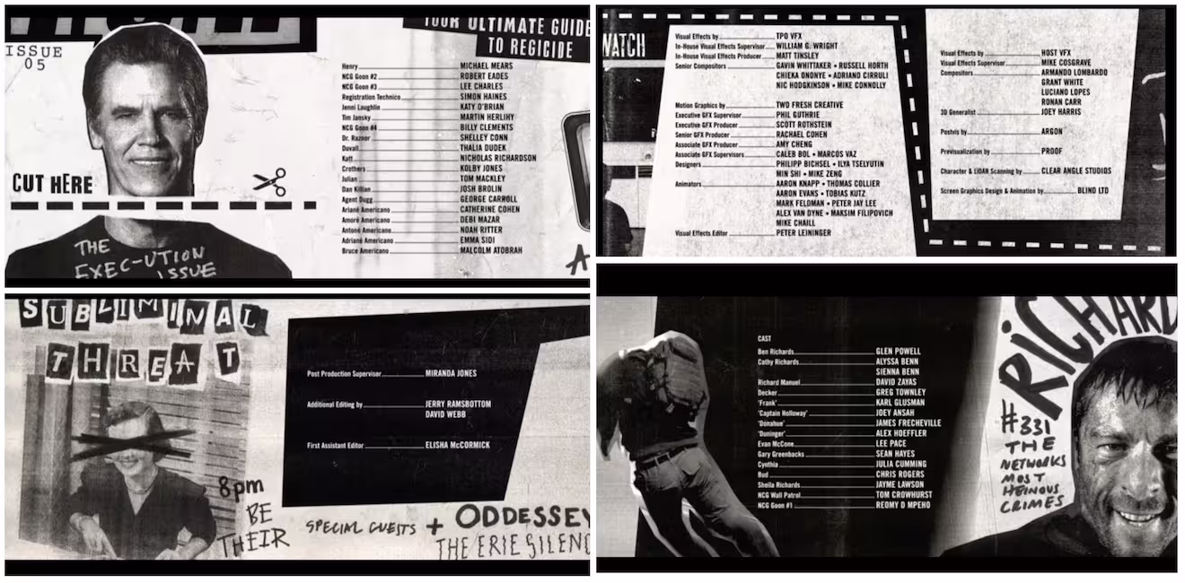
The spec this year was a fanzine style, which is a very tactile paper based medium, which doesn't always translate well to digital. The actual visual impetuous came from the (very fun) Running Man remake, the credits in particular:
The CSS
It's very likely a lot of this (clip-path for instance) have been around for ages. But my client work has been almost exclusively on API backend design for the last 4 years or so, which means FFConf is usually the only time I get to work in the front end to a specification.
Vertical text
I had been wrestling with transform rotates and origins, and had the text sliding all over the place.
Ana Tudor came to my rescue and took away all the pain in a simple single line: writing-mode: vertical-lr. An absolute slam dunk for getting text along the side.
Ana's other tips
inset: 1can be used as a shortcut instead oftop/left/right/bottom: 0when stretching across the page.- I don't need to do
transition: rotate(180deg),rotate(and others) are first class now, sorotate: 180degworks (less bytes too).
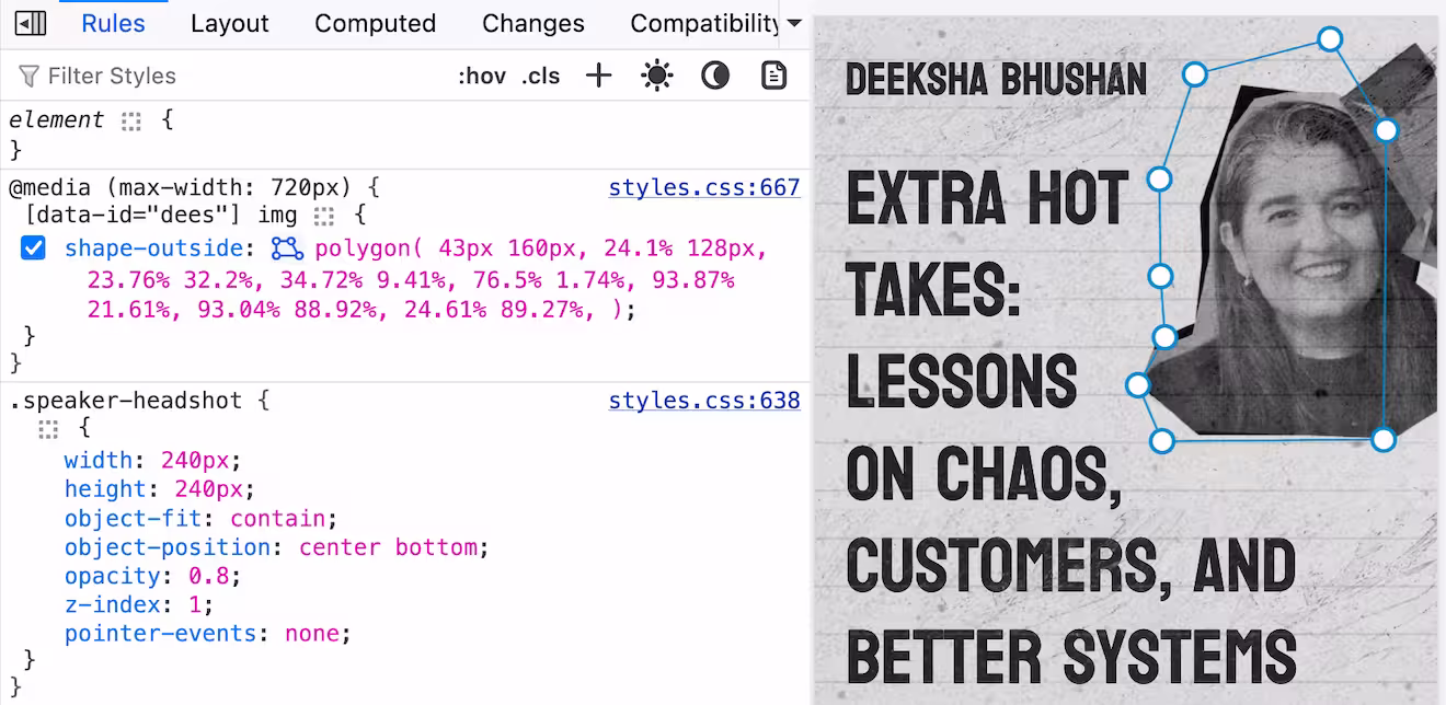
Polygons
I'd not used polygons in CSS yet (didn't have the use case), but due to the cutout nature of the speaker photos, and the proximity to the talk titles, I quickly realised (after failing with margins) this was the way to go.
shape-outsidefloating the element and having the text shape around the element, in particular the cutout of the speaker photosclip-pathletting me create the sharp angle shape on the footer- Firefox interactive polygon devtools
I would primarily develop in Chrome Devtools directly using workspaces, but Firefox offers interactive polygon editing which was immensely useful.
Contrast issues
Due to the effect of the "paper", I didn't want to make all the text partly opaque, so instead I lay the paper (which is mostly transparent) over the entire page (with pointer-events: none).
This did mean that there was some grey flecks of colour over black text which definitely caused contrast issues.
In skimming the rendering options in Chrome's devtools I found the "Prefers Contrast" (I'm not sure if I knew about it already or not).
Using @media (prefers-contrast: more) allowed me to remove the paper effect and keep a striking black and white design.
But what if the user wanted control? I added a labelled checkbox and found that instead of using the @media query I could use @container style(--high-contrast: 1). All the modification styles are nested inside of the @container query.
Then the --high-contrast is toggled using:
:root {
  --high-contrast: 0;
}

@media (prefers-contrast: more) {
  :root {
    --high-contrast: 1;
  }
}

body:has(#high_contrast:checked) {
  --high-contrast: 1;
}
Bonus bits
I hadn't realised I could style the ::placeholder pseudo element (not sure why I thought I couldn't).
Lastly, a lovely win for me, I discovered nth-child(odd of <selector>) 🤯. I was trying to set the speaker blocks with alternating position of their photo (which I'd select with odd and even), but there was an extra element between each speaker.
In reviewing the MDN page I discover the of syntax, and it let me target exactly the way I need using: &:nth-child(odd of .speaker-card).