This is a shorties as blog posts go, but a goodie, and certainly one for future Rem to read.
My default machine for development has a trackpad for input. Both in the laptop state and when I have it connected to an external monitor. Up until recently, I had no idea that other users were seeing a very different view of my web pages than I was.

MY EBOOK£5 for Working the Command Line
Gain command-line shortcuts and processing techniques, install new tools and diagnose problems, and fully customize your terminal for a better, more powerful workflow.
£5 to own it today
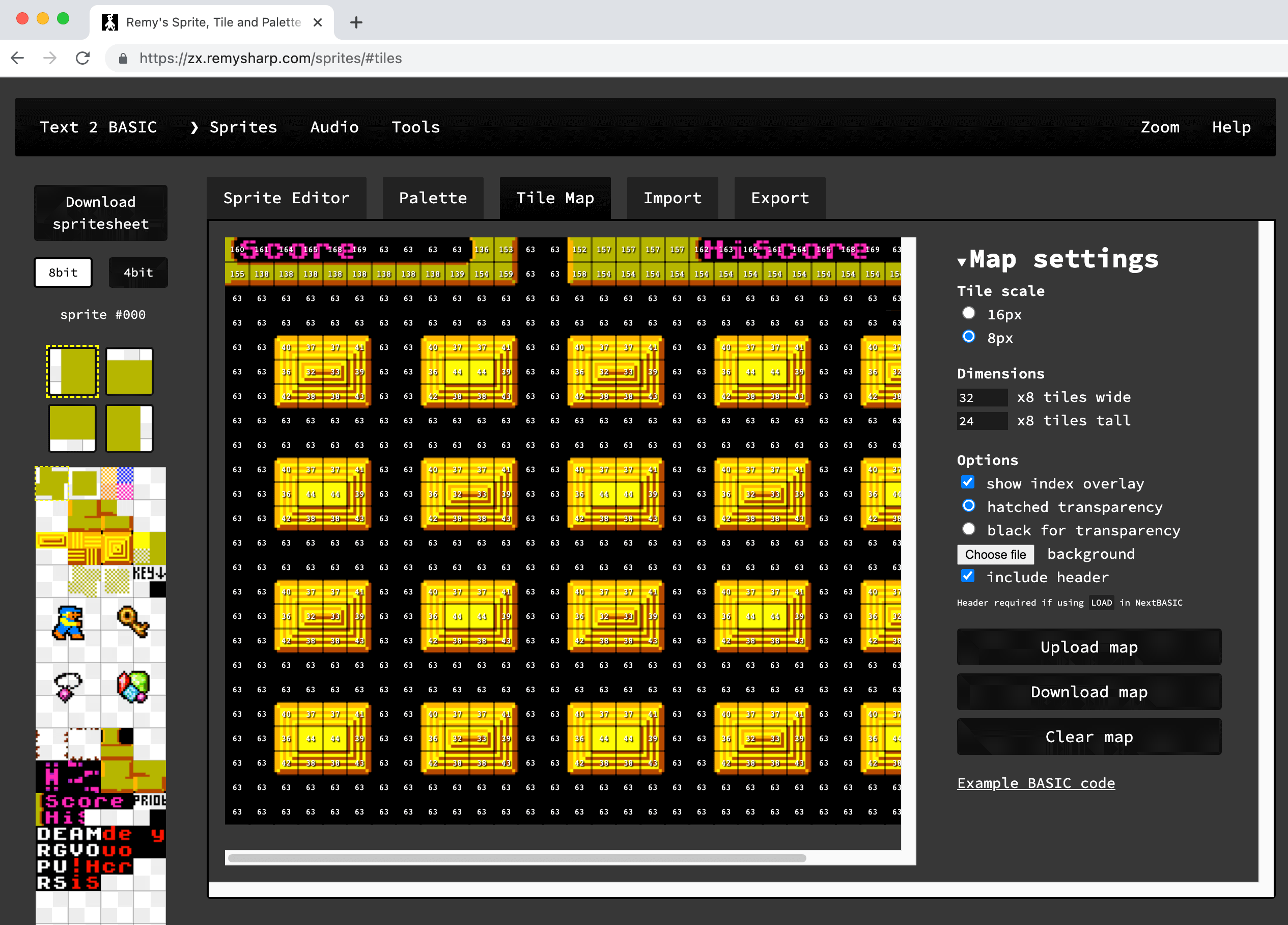
My trackpad was playing up (bluetooth interference or something) so I switched to a mouse for input. At which point, all of a sudden, solid white bars started popping up all over the place:

These empty scrollbars (bottom right - twice) serve no purpose and don't really go with the aesthetic of the web site.
Removing the scrollbars was easy, and dosh darnit, obvious:
#tiles {
  overflow: scroll;
}
Should have been:
#tiles {
  overflow: auto;
}
Then the scrollbars appear as and when needed. I've been doing web dev for two decades now and I know what this property does. The problem was, I didn't see the actual effect of changing it until I plugged my mouse in to my computer.
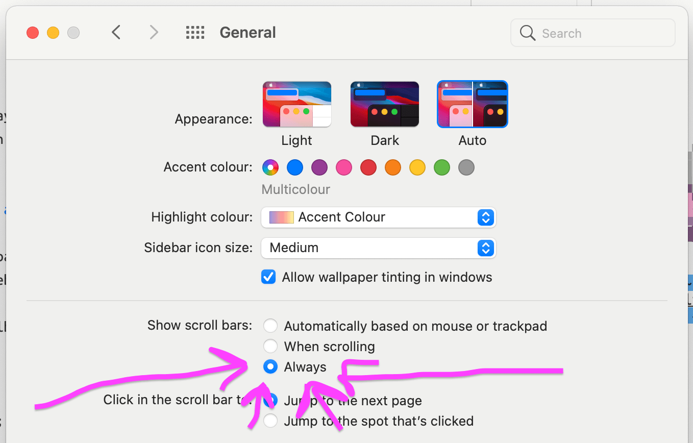
So, to get eyes on this UI quirk, without having to constantly swap out my input device, I can use the general macOS setting of "always show scrollbars" - even if I turn it on and off 🤦♂️

Filing this post under: things I shouldn't have to write to future Rem about.