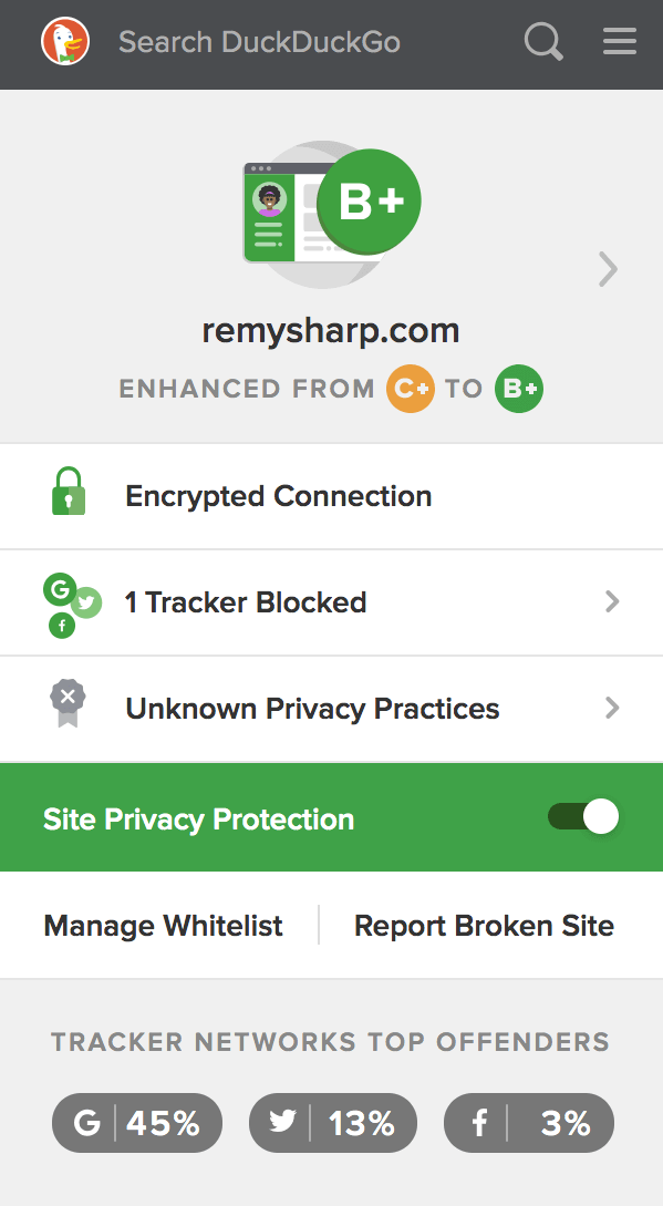
Recently I've been using the DuckDuckGo browser extension that gives me a web site privacy score but also the number of trackers (blocked) on the web site which I've enjoyed getting insights on what has been blocked.

MY EBOOK£5 for Working the Command Line
Gain command-line shortcuts and processing techniques, install new tools and diagnose problems, and fully customize your terminal for a better, more powerful workflow.
£5 to own it today

Seeing trackers surfaced in this way made me aware that by including a "here's me on Twitter" on my own blog, I was unwittingly giving Twitter tracking powers from my own site. What's interesting is that I was never aware that adding this widget to my site would give Twitter this power over my unsuspecting visits. And it's kinda not okay.
In my blog software refactor I decided to keep the functionality of letting people follow me, see my follower count and keeping the style, but drop the unsolicited tracking.
Picking the widget apart
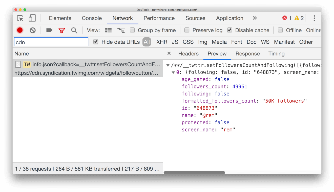
When running a network trace when the Twitter widget is embedded, under the "alternative" domain twimg.com, you'll find that there's a JSONP request that looks like this:

So a cURL to the info.json yields some pretty useful information, although it looks like a static URL, it certainly looks dynamic enough to provide the content for a Twitter widget:
[
  {
    "following": false,
    "id": "648873",
    "screen_name": "rem",
    "name": "@rem",
    "protected": false,
    "followers_count": 49961,
    "formatted_followers_count": "50K followers",
    "age_gated": false
  }
]
We could keep the request in the client and benefit from info.json's JSONP support (and checking the network request, there's no cookies exchanged in the request, so technically "safe")…but I'm not a fan of superfluous JavaScript. As such, this is a great candidate for a single server side request during build.
Moving to the server
What we're interested in here is the follower count. Since these numbers don't change a great deal, don't mean a great deal and are ultimately hidden in rounding - a single build (for me) every fortnight is fine (I publish at least two blog posts a month). Though you could schedule a rebuild of your site once a day using other services (I've start on cron.jobs to do similar tasks, but it's far from public yet).
Now this process is part of my static build which is generated on Netlify, I then expose the raw Twitter values in an accessible way.
My site uses a bespoke system, but let's say you were using something like 11ty, you could include the following as part of your build package.json:
"scripts": {
  "prebuild": "curl https://cdn.syndication.twimg.com/widgets/followbutton/info.json?lang=en&screen_names=rem > _data/twitter.json"
  "build": "eleventy"
}
According to 11ty's data docs, the Twitter stats will be available in global twitter property in your templates.
Now it's a matter of implementing the look and feel.
Look and feel
Forewarning: there's more HTML here than I might include, but I've lifted it directly from the widget so that I can completely reuse Twitter's styles (albeit slightly tweaked):
<div class="twitter-badge ltr ready hcount count-ready">
<div class="btn-o">
<a
class="btn"
id="follow-button"
href="https://twitter.com/intent/user?screen_name={{ twitter.screen_name }}"
><i></i><span class="label" id="l">Follow <b>@{{ twitter.screen_name }}</b></span></a
>
</div>
<div class="count-o" id="c">
<i></i><u></u
><a
class="note"
id="count"
href="https://twitter.com/intent/user?screen_name={{ twitter.screen_name }}"
>{{ twitter.formatted_followers_count }}</a
>
</div>
</div>
The empty <i> and <u> elements, I believe` are being used for styled blocks - though I'd loved to remove these entirely if possible.
Now a dash of CSS, note that this syntax is less - which in this case is CSS with nesting, and aside from the &.<selector> where & refers to the current scoped selector, it should be fairly regular CSS - provided as a download for brevity.
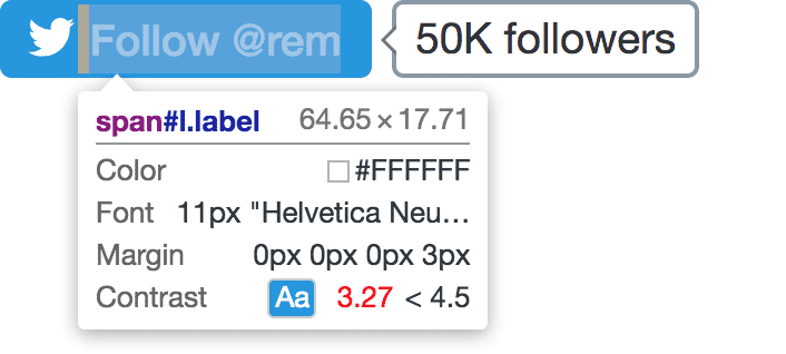
The minor adjustment I made to the existing Twitter CSS widget is to make the blue from the "follow @rem" and white have a higher contrast radio for better colour accessibility (the current default fails which I'm quickly able to see using Chrome's devtools inspector):

I shifted the blue down to #31759f and that minor change also puts more control into my hands now that I'm managing the CSS that renders the Twitter widget. And that's really it.
One less tracker on my site for my visitors.