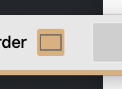
I don't often use the <input type="color"> element but in using it recently I noticed there's a very light border around the selected colour.
I wanted to remove it (to match the style of the software I was writing) and initially assumed it was a border, it's not.
I also noticed that when I sized the element it wasn't sizing the colour picker part, but a larger area around the element, so I decided to add a background-colour to match the current value of the picker to help with the style.
But if you look carefully there's a faint border around the actual value of the picker.

I also tried the -webkit-appearance: none to strip all browser UI style, but that made no difference. Though I was barking up the right tree.
The native style can be targeted using:
::-webkit-color-swatch,
::-moz-color-swatch {
  border-color: transparent;
}
This snippet will hide the border (the way I wanted). And of course the eminent Ana Tudor has written up a much, much more detailed dive into this area over at CSS Tricks.