In using the web, and listening to "12 days of Christmas" my mince pie addled brain decided it would be neat to do a list of things that annoyed me that were clearly crappy in web products. Except I crapped out at 10… so, yeah, there's 10.
Hence my list of faux pas, mashed with christmas, thus faux pas'mas…
1. Infinite scroll/escape
If your site insists on having an infinite scroll, do not, do not put links in the footer of the page. It's pretty obvious, but those links are impossible to reach. Instagram is the site that springs to mind, if you want to get any of those links in the footer, like the privacy policy, you'll have to be faster than the infinite scroll.
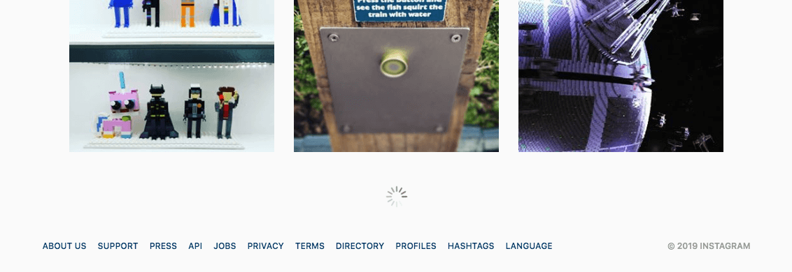
Better yet, give the visitor the option to get more results. DuckDuckGo do this, and occasionally so does Flickr. This also protects against your infinite scroll breaking and leaving your visitor unable to paginate.
2. No no-reply
Don't send your email alters from no-reply@. This implies that the email just sent doesn't require a response, which assumes that there's absolutely no possible errors in your software, which is a fallacy. Even if the email isn't monitored by a human, it at least tells the subscriber that if something goes wrong, they can reply.
Moreover, putting a human at the other end of the email makes your product even more personable, which leads to better engagement, which leads to more money, which leads to more yachts (maybe).
3. Unnaturally not smooth scroll
Back in the days when Flash was used to create form fields, it was a nasty experience. It was the uncanny valley of the web. The form fields looked a little weird and they didn't behave the way the visitor expected.
Accelerated scroll is exactly the same experience. There's many WordPress themes guilty of this. Taking over the natural scroll behaviour to attempt to replicate something seen on an out of date iOS device. The side effect is often the scrolling becomes less sensitive and overshoots the target the visitor is aiming for.
4. Select and right click
Another uncanny valley bug. If there's text on the page, the visitor should be able to select it - because they're there for content and that content can go beyond the confines of the browser, like the visitor's clipboard.
The same goes for disabling right click. Right click may be being used to start text-to-speech.
The reasons these two tend to be used are to "protect" the content or software. Except those people who would even want to get to the content that much know the simple commands to circumvent that so called protection. Simple, because they open devtools, and now they're in. As it should be.
5. Slimy preferences
User preferences should be sticky. Not slimy. Slimy in that they appear to stick, but later, at some time, they've reverted.
If your site is using cookies to persist some kind of session for a visitor, respect their decisions. Twitter is the best culprit of this awful dark pattern.
If you change your timeline order to "latest" you'll be told that this preference will change to (aka: revert) to "home" after some (arbitrary) time.
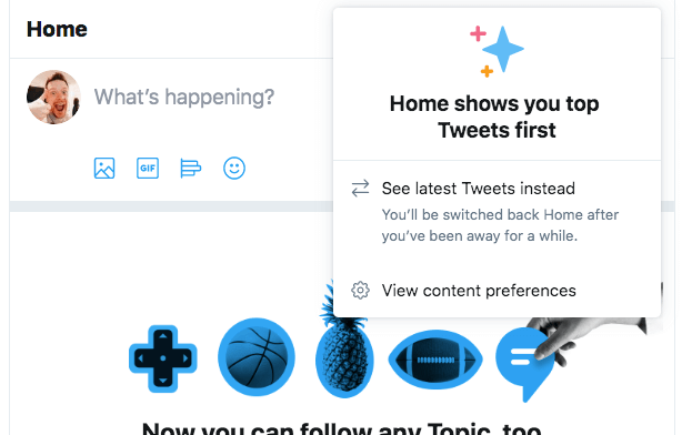
I strongly suspect that Twitter are trailing which timeline users prefer, but instead of respecting their army of users, Twitter will revert the preference effectively declaring the user as "wrong, Twitter knows best". They should really have the courage to decide on the functionality.
Trust your users.
6. Busted back
This one is as old as ajax: back means back. If your software is designed to take over how the browser navigates don't be surprised when the visitor uses the native browser controls. By this I mean to say: if the software wants control, it must supports the users natural behaviours before they must use the new bespoke ones.
Although many sites get most of this right, quite often they'll get it wrong with micro-navigations, where perhaps a gallery item is click or tapped on a product page. In many cases I've come across, particularly during mobile browsing, the product image will open in a mini gallery and when I gesture go to go back, I'm returned to the search results, not the product page I was just on.
Bonus points for restoring the scroll position.
7. No script is better than NoScript
If the page includes a noscript tag then the software is already pretty confident of itself. There's two categories that noscript has fallen in to:
<noscript>
This software requires JavaScript to run.
</noscript>
The above software entirely failed at progressive enhancement. It's a shame, because it means if there's even the smallest of failures in the JavaScript, not only will the software not work, but also the visitor will never see this (useless) message.
Then my favourite:
<noscript>
This app works best with JavaScript enabled.
</noscript>
This isn't so much of a message than a challenge. This is a competition between a JavaScript enabled page vs. HTML and CSS (which the JavaScript version also has to carry).
The JavaScript version needs to parse and execute all it's JavaScript. The JS-less page has none of this to do. Then there's potential mistakes in the JavaScript, such as rehydrating React-ish pages when it's not needed (I've seen this too often).
This particular noscript line comes from Gatsby. Funnily enough, Gatsby tends to be used for static sites, and yet the tests I've run, with JavaScript disabled, the Gatsby pre-rendered HTML renders and performs so much faster. It loads faster too. So, be careful about declaring a race against HTML!
8. Pushy push notifications
Allowing a push notification is allowing a web site inside the safe circle of notifications of the visitor/customer/user. This is a privileged space.
It's painfully obvious, but if a visitor is prompted to allow push notifications as soon as they've landed on your site, or in fact visited any page without context, the push notification is going to be sent to the sin bin, forever.
Provide context as to why a visitor would want to accept your push notifications. Build trust with your visitor, and your visitor will want your instant push notifications.
9. JustScript
Do not rely on JavaScript to run an entire page serving only HTML tags to run JavaScript. It will fail and your site looks like a damn fool. Stuart Langridge has an excellent cheat sheet if you still think "but it's fine to rely on JavaScript"
10. Just open your damn site on a mobile phone
At least add the viewport meta tag, but do us all a favour and actually view the damn site on a mobile phone.
If it were the early 21st century you'd be forgiven if your site was illegible on a mobile device, but small device screens make up a huge amount of the market (no, I have stats for you - just trust my hand wavy "fact"), and assuming that your visitor will only want to view your site from a desktop is once again assuming you know more than your visitor…which will be your downfall.
Stick the meta tag in and view the site on a phone (not an emulator):
<meta name="viewport" content="width=device-width">
11 & 12
These are for you to fill out. I'm sure there's some…or many horrible grimy parts of interacting with the web that creeps you out. Feel free to comment below and share your entries for 11 and 12 👍