Lately I've been making a slew of changes to JS Bin to provide mobile support, and due to the natrue of the work, I've had to switch between desktop (or "wide" view), emulator (via devtools) and real device. I've learnt loads of little tips which I'll share here.
There's a × character in most common fonts which you should use instead of an x for close, but getting it to look right across devices requires an eye for the detail.
Here's a screenshot of the simulator vs. the real device, with exactly the same CSS applied to create the effect. Notice that the vertical align is off?
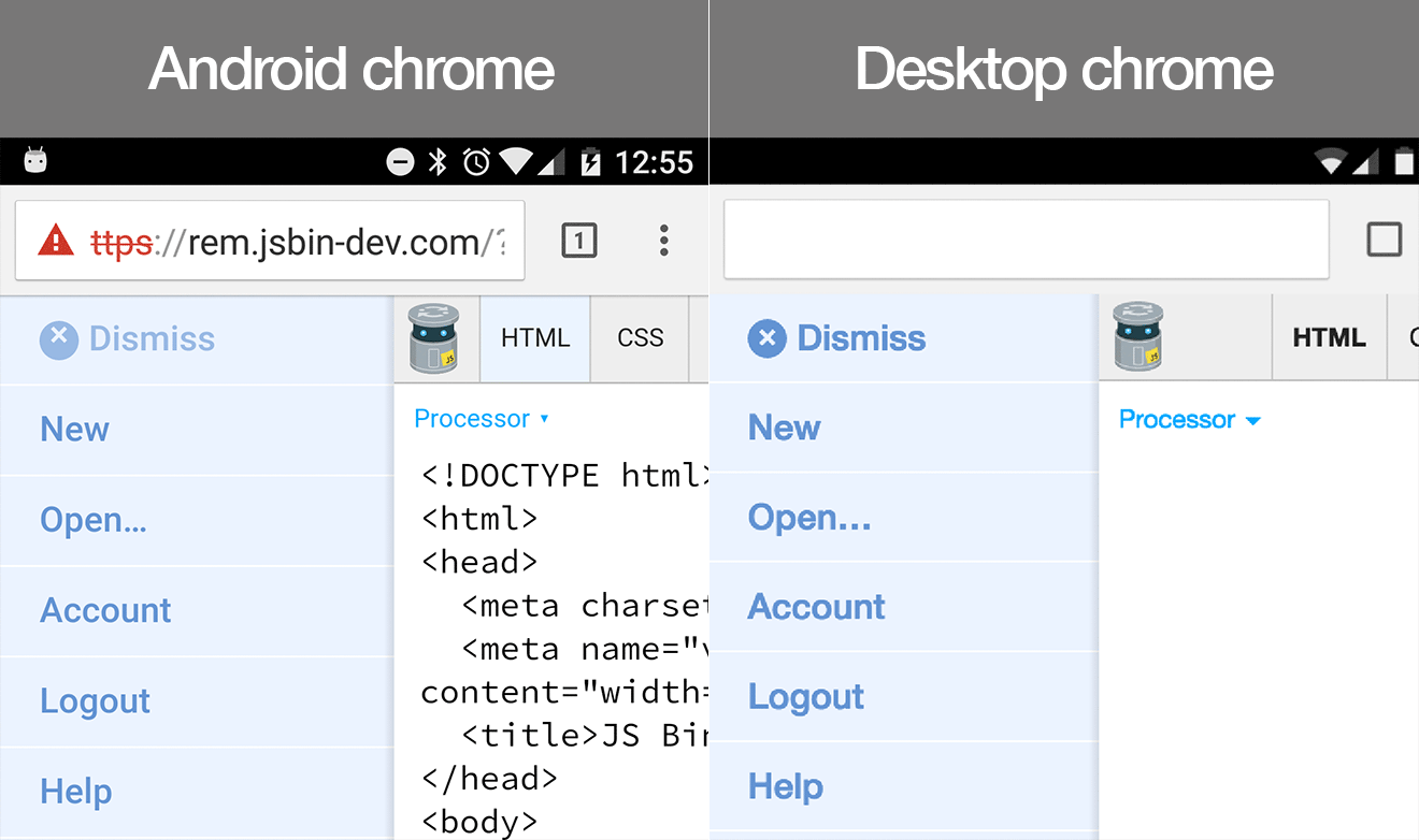
It took me a while to work out what was different, but it's the font. The font I'm using (if you're on a Mac - as I was), is Helvetia Neue, but my Android doesn't have that font, so it was falling back to the next default (possibly set as sans-serif, which could be Open Sans, or it could be something else). In this case, the different font had a slightly different letter height, so it caused (obviously) as slightly different result.
The pro tip: make sure to use a common font, probably Arial (
Yes, I know this is obvious if you're using an icon font…but maybe not immediately obvious if you're re-using system fonts.