Check out my latest project: Full Frontal JavaScript Conference

New Blog Design

As mentioned at the end of last year, I wanted to put a new design up for my blog. The main reason behind the decision was this blog's focus is code, and the design I had was way too narrow for the code samples.

Since I'm a developer and not a designer, it's taken me 2 months of dabbling to get something I'm finally happy with.

I know the design is pretty plain, but the stats for my web site are nearly entirely the code pages, so I've got to accommodate for that - plus, I've got unresolved conflict over round corners and "web 2.0" colours. This new design goes back to the root of my beliefs - i.e. skip to the good stuff.

There was a considerable amount of pain fixing my tagging structure after I got semi-hacked. In the end, I decided to ditch Simple Tagging, and covert my existing tags to the new Wordpress tagging structure (not without it's problems though) (I'll post about that later). Hopefully though, all the tags are back to life.

Here's a comparison from the new and old - I think the biggest win for me is how the content stands out more:

Page Comparison

Homepage Comparison

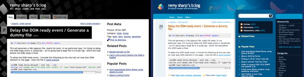
I'm happy with all of it, perhaps with exception, of the front page, where I'm generally pimp myself a little.

I also included my twitter status in the header block, but Twitter's been playing up - so I might include it when it's working again.

I'd love to hear any feedback, good or bad - especially if you find bugs.

Oh - and I've noticed in IE6 (my downgraded parallels version) that the code doesn't overflow correctly when it's too wide - any suggestions?

8 Responses to “New Blog Design”

  1. I should also add, I've fixed the blog feed so the whole content appears again - sorry about that!

  2. Sweet design remy, only thing I would add is that you need to give your links :focus styling as you do on :hover.

    Other than that, awesome job - nice and clean, with no clutter.

  3. Great job Remy! I'm getting ready to do a re-design of my own, so you've given me some ideas to think about. Thanks.

  4. Remy, I don't really like the black background. I think it would look better with a dark grey. e.g. http://img.photobucket.com/albums/v215/thegooddale/remy.png

  5. Regarding the IE6 code overflow glitch, it seems to be a problem with our old friend "hasLayout" :-)
    This is what I did on my blog to fix it:

    I added this to my header file after the main css loads

    
     <!--[if lt IE 7]>
    	<link rel="stylesheet" type="text/css" href="/ie6.css" />
      <![endif]-->
    

    And then I added the following style rule to the ie6.css file

    .post-content pre{
    	zoom:1;
    	overflow:scroll;
    	width:100%;
    }
  6. @Yansky - I originally had a #212121 type colour (the same used on http://remysharp/jquery-api/ ), which indeed I prefer - it's not as stark. Equally, I like my background block effect - it's my subtle way of saying "this site lets the blocks fall in to place" :-)
    All that said, on your screenshot, did you take out the transparency on the header - it is it just not there? ::bloody IE png transparency grumble grumble::

    Finally - just caught your last comment - overflow: genius - thanks so much!

  7. "did you take out the transparency on the header "

    Yeah, I was just messing around with the colour headers. :)

  8. I think it's very nicely done :)

    If you quickly scroll up and down in the top part of the page, you get a nice retro psychedelic effect (BTW)....

Leave a Reply
Not required

CODE: Please escape code and wrap in <pre><code>, doing so will automatically syntax highlight